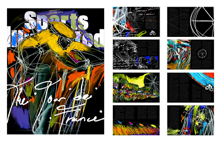
Tour de France 2011
Editorial Layouts
Multi-page layout based off of reportage of the Tour de France. These designs were based off of the concept "Man and the Machine" and uses vivid colors and a black background to emphasize the science-fiction/space-age nature of the Tour.
Click here for more reportage drawings of the Tour.
Continue below for individual spreads.
